5 Top Tech Solutions For Hybrid Companies
With over 50% of US workers working remotely at least once a week and tech solutions catching up quickly to meet the new challenges faced by modern businesses, hybrid workplaces... Read More

6 ways to save $$$ on your office space.
Learn more >October 19, 2018 | by
Reviewed by real estate expert Michael Colacino
Studio A+H recently designed Managed by Q‘s new office in New York. We interviewed the designers and were able to learn more about this dynamic office space.
What does this office say about the company you designed it for?
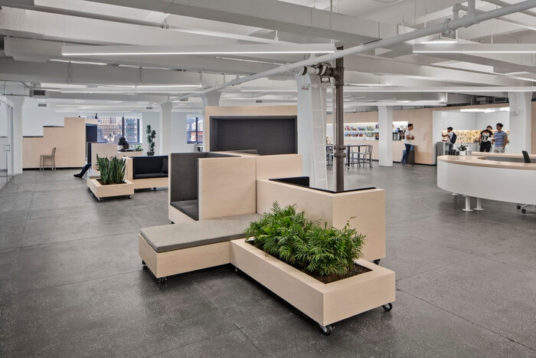
Managed by Q HQ merges two sides of a business that rarely meet: the high tech IT headquarters with the daily grit of office cleaning and management. The space is designed around two main ideas, the flexible office space and the program specific wall, which creates a balance that caters to the core of the Managed by Q brand: an office that has the ability to evolve and change on a daily basis while still maintaining its core design identity.
 SquareFoot
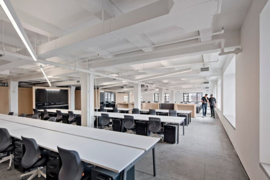
Describe the layout of this office. How does this office design encourage creativity, productivity, and team happiness?
The flexible office space allows for a continuous ebb and flow of activity throughout the day with the only fixed element being the centrally placed Q station, a combined standing meeting and reception desk that act as a fulcrum for the diversity around it.
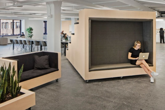
Within the main space, movable full-height raked seating bleachers can be rolled around to physically alter the main space in scale and set up a variety of configurations ranging from smaller scale meeting areas to the monthly all-hands gatherings for hundreds of people.
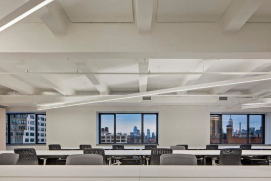
In addition, smaller clusters of movable lounge furniture and planters are designed to create constantly changing configurations and opportunities throughout the day for employees to meet and work in any way imaginable. This complements the existing exterior walls, which have been built out to create cushioned seating areas allowing people to enjoy the dynamic views in all directions.
As a backbone to the flexible main space, the fixed, programmed, back wall provides all the key elements needed to run the office efficiently on a daily basis along with a few hidden spaces for the employees to use.
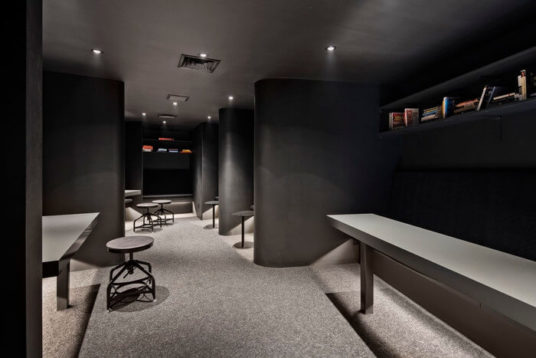
What does the space do best?
With a focus on maximum flexibility, the new design allows for Q to reconfigure how they work and interact on a daily basis. This directly reflects the growth and flexibility that is at the core of the Q brand.
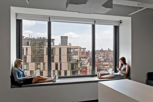
What went into choosing the colors and materials for the office’s decor?
We wanted to use a palette of neutral tones to put the focus on material qualities and textures in relationship to the type of light in the space. We also wanted the material to act as a kind of program coding. Natural materials (maple panels, concrete floor and counters) were used for the space and the array of flexible and operable objects, allowing for a light and playful interior that could change at any given moment on both larger and smaller scales. Other materials (Corian clad niches, aluminum clad conference rooms, and black finished private work areas) highlighted necessary spatial qualities for these functions. Finally, a range of grey fabrics and carpeting were used to bring complementary textures to the space.
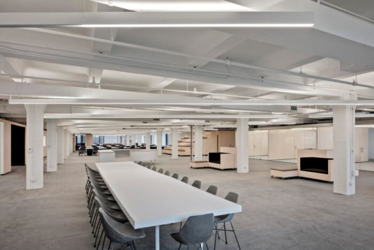
What is your favorite part of this office?
During the phased completion of the project after the client moved in, we visited the office many times as Q settled into the space. Every time we went there, the space had a different configuration and dynamic.
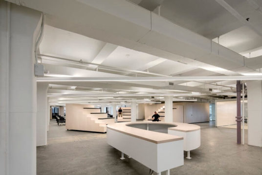
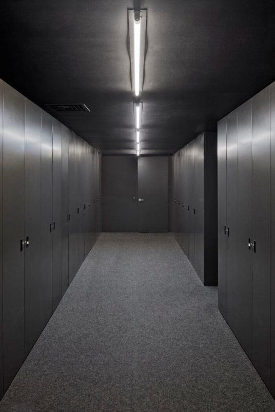
Photographer: Archphoto/ Eduard Hueber
Designer: Studio A+H
SquareFoot is a new kind of commercial real estate company. Our easy-to-use technology and responsive team of real estate professionals delivers the most transparent, flexible experience in the market. Get in touch to start your search today.