5 Top Tech Solutions For Hybrid Companies
With over 50% of US workers working remotely at least once a week and tech solutions catching up quickly to meet the new challenges faced by modern businesses, hybrid workplaces... Read More

6 ways to save $$$ on your office space.
Learn more >October 23, 2018 | by
Reviewed by real estate expert Jonathan Wasserstrum
In 2017, Nike Communications had their office in New York designed by HUXHUX Design. We reached out HUXHUX Design to learn more about their stylish design. 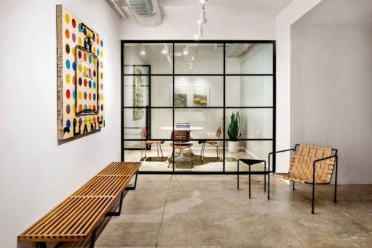
What’s the first thing someone would notice in this office?
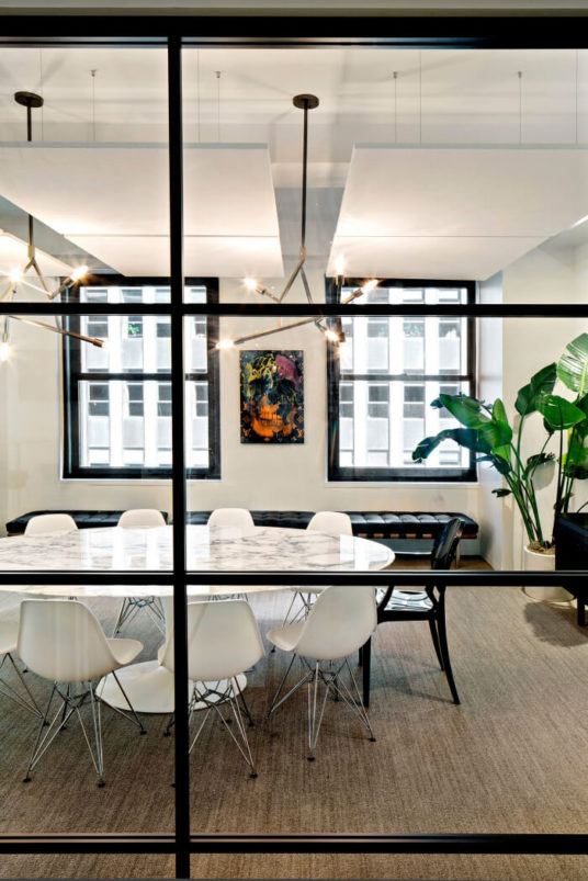
The moment you step into Nike Communications you feel a crisp clean and highly edited space. Whether it’s the original art or collector furniture that catches your eye first, you are immediately keyed into an awareness that this office was very carefully curated and designed.
What does this office say about the company you designed it for?
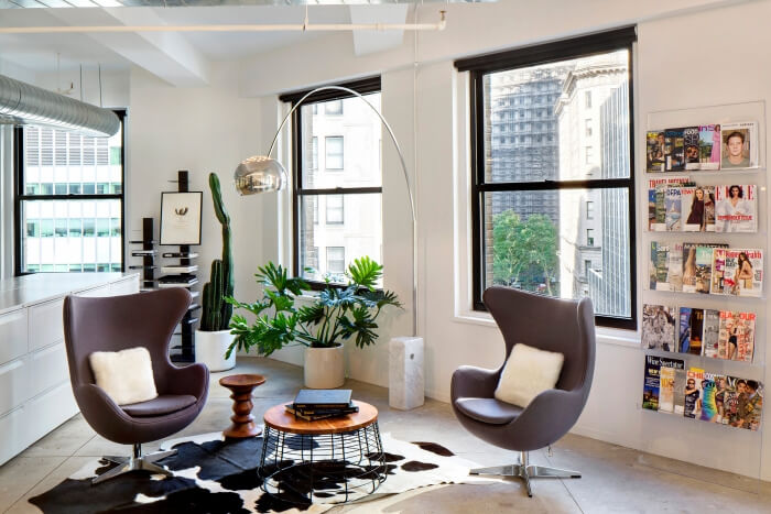
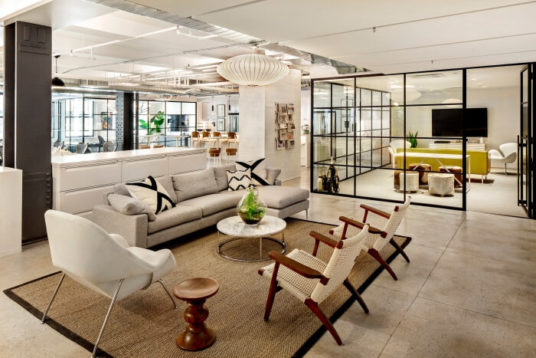
Working closely with the CEO, we made sure that each space in the office perfectly suited the needs of the client. They wanted their offices to feel comfortable and inviting without the extra frills that often accompany office design. By mixing original mid-century furniture pieces with contemporary designer pieces, the space feels perfectly situated in a lineage while also embracing the best of what’s happening in the design world.
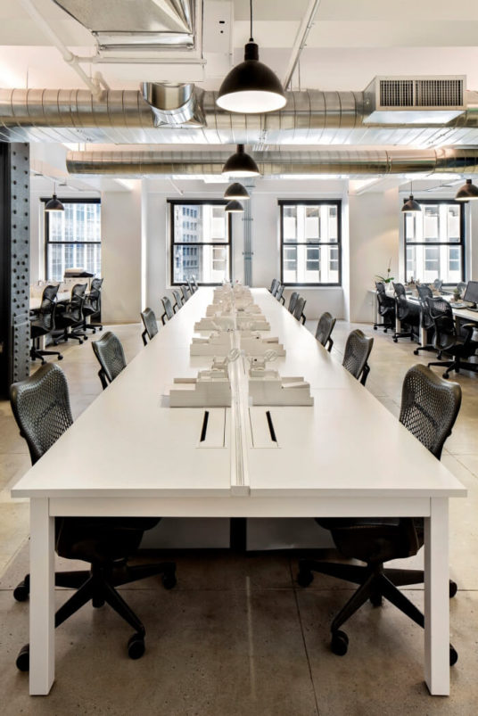
Describe the layout of this office. How does this office design encourage creativity, productivity, and team happiness?
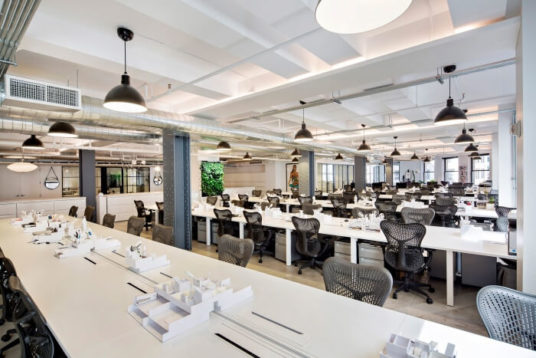
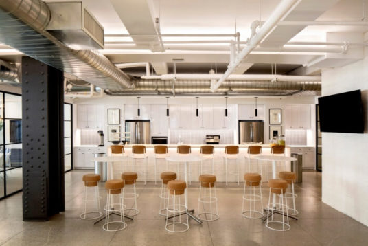
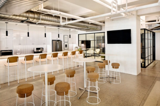
We opted to keep things as open and connected as possible in an effort to support a tight collaborative work environment. Even the meeting and huddle rooms were glazed to keep an air of transparency at the forefront of their office culture. A large informal lounge greets you when you walk into the open office space. This allows guests and staff to mingle and also provides a large gathering area where all staff can meet. We designed a cafe rather than an office pantry, so the space is front and center in the open office, not stuck in a typical corner or pushed to the side.
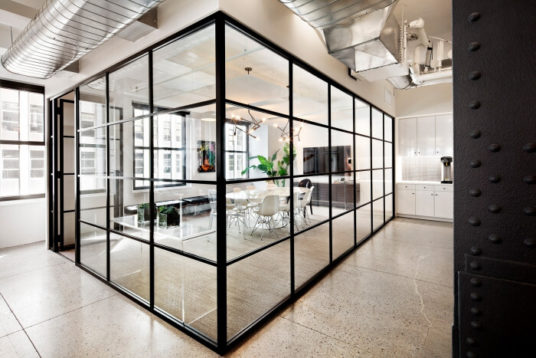
What does the space do best?
This office is a perfect example of an ideal office in an elevated refined setting. Beyond style and curation, the focus is on workplace wellness. We have selected natural materials wherever possible, installed two living green walls, and maximized natural light throughout. The client’s desire for a healthy workplace where staff can work long hours and still feel welcome, energized and motivated by their environment was a driving force for the design of this office.
What went into choosing the colors and materials for the office’s decor?
We opted for a clean, bright, high-contrast palette. We wanted each productive space to have a “clean slate” feel so that creativity could be taken in any direction.
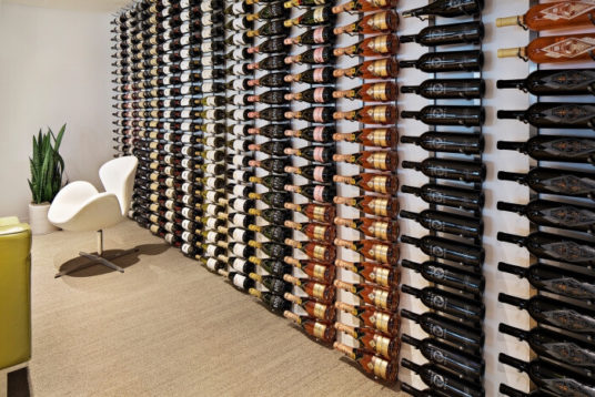
What is your favorite part of this office?
The cafe is a perfect element of this office. With multiple seating arrangements, the cafe invites visitors and staff to use this space for all sorts of purposes. It sits at the head of the open office and serves as a center of gravity for office life.
Photographer: HUXHUX Design
Designer: HUXHUX Design
SquareFoot is a new kind of commercial real estate company. Our easy-to-use technology and responsive team of real estate professionals delivers the most transparent, flexible experience in the market. Get in touch to start your search today.